|
Through this tool, StatEL fills some of the oldest gaps about charts of Excel:
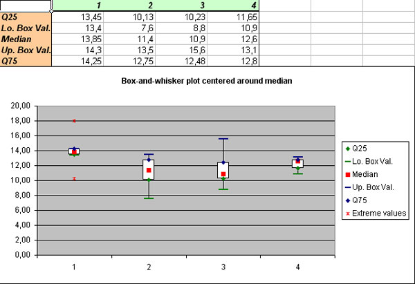
- whiskers plot or boxplot, centred around the mean or median,
- histogram or cumulative distribution function,
- ternary plot,
- 3D scatterplot, with ability of rotation, zoom on a specific area of the graph, display of labels...
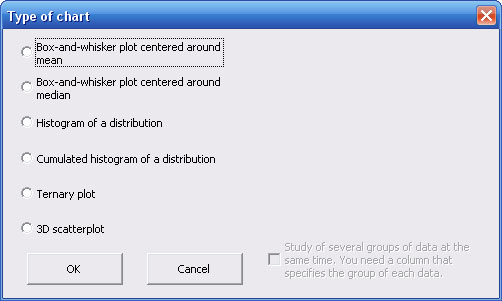
1 - Choice of chart :
A dialog box allows you to choose between 6 different charts types:
If you choose to draw a whiskers plot or a ternary plot, you may opt for the linked representation of several dataset on the same chart, by ticking off the checkbox (lower right corner).
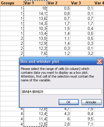
2 – How to draw a whiskers plot :
StatEL just requires you to select the cells range related to data for which you want to display the distribution in a boxplot:
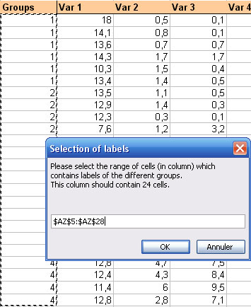
If you ticked off the checkbox to display several groups of subjects on the same chart (in the first dialog box), then Statel requires you to select the cells range related to labels of groups:
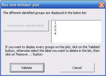
StatEL shows the list of the different identified groups in a new dialog box. Thus, you may delete any label in the list:
Click on the 'Validate' button to perform the whiskers plot:
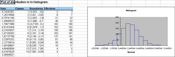
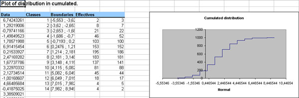
3 – How to draw an histogram or cumulative distribution function:
The selection is the same than for whiskers plot. Please check the previous section of this page to know how to select your data.
A typical histogram chart with StatEL:
A typical cumulative distribution function chart with StatEL:
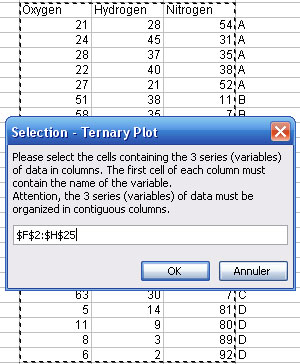
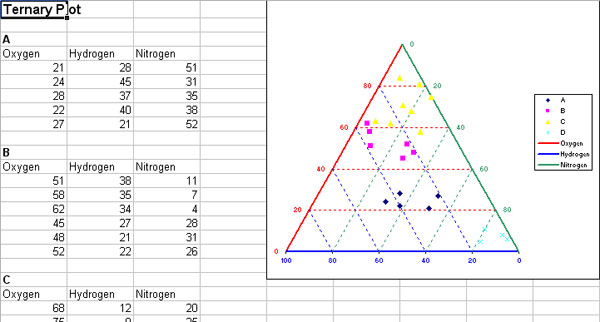
4 – How to draw a ternary plot:
StatEL just requires you to select the cells range related to the 3 required measures series. Sum of each triplet or data must be equal to 100% (or 1). Data should be organized in columns with the name of each variable in the upper cells. The 3 columns mus be contiguous in order to select all of the mat the same time.
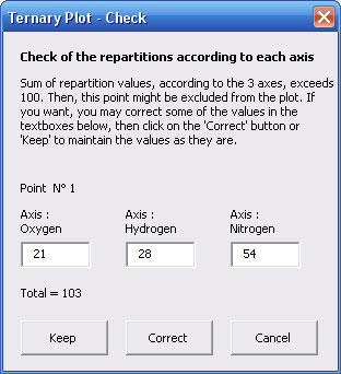
If among your data, some sums of triplets are not equal to 100 (% or to 1), then StatEL allows you to correct your data in a new dialog box:
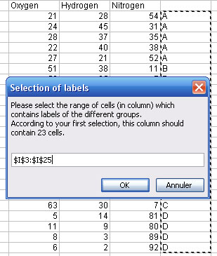
If you ticked off the checkbox to display several groups of subjects on the same chart (in the first dialog box), then Statel requires you to select the cells range related to labels of groups:
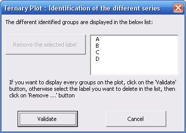
StatEL shows the list of the different identified groups in a new dialog box. Thus, you may delete any label in the list:
Click on the 'Validate' button to perform the ternary plot:
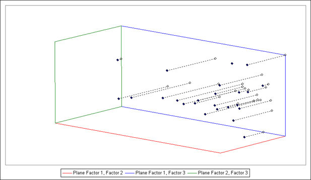
5 - How to draw a 3D scatterplot:
StatEL needs you to specify the range of cells corresponding to the 3 required measures series. Each triplet of values (x, y, z) represents coordinate of one point. Data must be organized in columns with name of variables in upper cell. If your columns are not contiguous, you have to proceed to a multiple selection through 'Ctrl' key.In case of mistake, you just have to resume your selection.
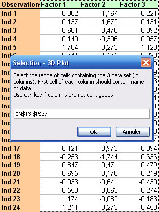
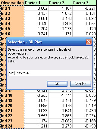
Then you have to select range of cells contening of observations (StatEL specifies the number of cells that is required, according to your previous selection) :
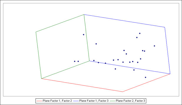
2 - Display of 3D Plot :
Graph, as well as modification tools, appear on a new sheet of your Excel workbook.
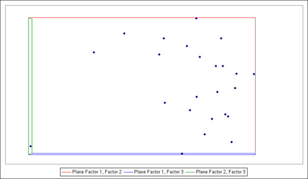
By default, points are observed as projection on plane constitued by 2 first variables of your data set. Each of the 3 planes has its own color (red, blue and green). You can move position of observer (i.e. you) by changing angles of observation via horizontal scrollbars :
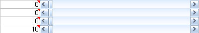
Cells on the left of the 3 first scrollbars show values (in degrees) of your rotation since start position, according to 3 axes.
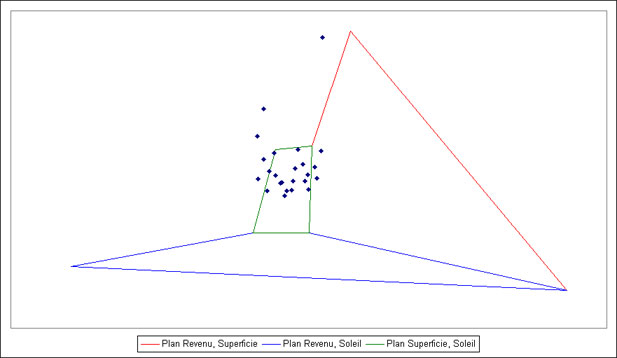
Lowest scrollbar informs you on distance to scatterplot. This functionnality is useful when the 3 variables are measured with very different scales. In this case, planes of projection may look weird. This is due to anamorphosis distortion (cf. below) you can correct by "moving far" from the graph (i.e. by increasing value of lowest scrollbar).
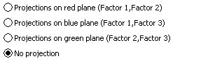
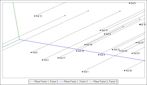
In order to ease perception of relative positions of points, you can visualize projections of points on the 3 planes via option buttons :
At last, checkboxes just above the graph allow you to :
- display names of every points on the graph,
- center planes of projections on point (0, 0, 0),
- remove automatic scale, because if you change value of scrollbar which determines your position relative to the scatterplot, you will not have the "sensation" to go away if automatic scale is activated : untick this case and change value of the lowest scrollbar and you will see scatterplot increase or decrease. This function is useful if you whish to zoom in on a particular area of scatterplot :
|